This is our completed sketchbook:
Friday, 12 March 2010
Final sketch book prints
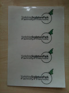
The group votesd on the final design and this was the outcome. Oringally the images were going to be stenciled onto the books but there was too great a chance that it could do wrong and also it did not creat a professional finish.
Here are the final prints that have been done on self adhesive transparent acetate.
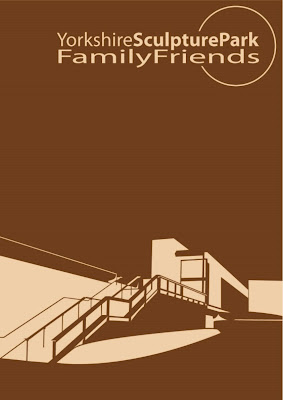
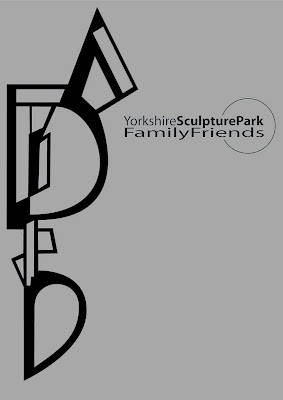
Final sketch book cover design No.2
Final sketch book cover design No.1
Final Products
Below is a list of designs for the final products, represented in 2D form.
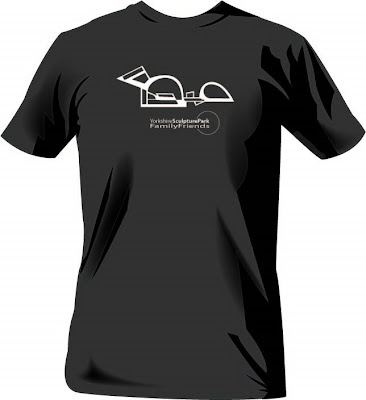
T shirts
Each design printed on each colour, sold in Small, Medium and Large sizes for £15.
Poster
This Poster would be printed in 920 x 610mm on to a matt recycled paper and sold for a price of £3.99 on to laminated paper or £4.99 on to a matt recycled paper to cover the increased cost of recycled materials.
Thursday, 11 March 2010
Final Products
Below is a list of designs for the final products, represented in 2D form.
Poster
Poster
This Poster would be printed in 920 x 610mm on to a matt recycled paper and sold for a price of £3.99 on to laminated paper or £4.99 on to a matt recycled paper to cover the increased cost of recycled materials.
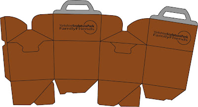
Lunchbox
The net shape would be printed out of an A3 page and printed on to laminated card. They would be sold in the shop at £2 as a disposable item, rather than a souveneir.
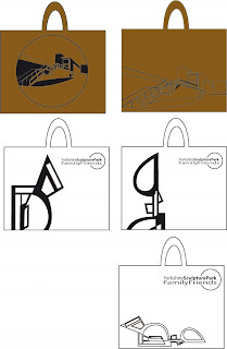
Canvas Shoulder Bag
Tesign printed on 350x400 mm canvas bag. Sold at £7 to include roughly equal amounts of material cost, printing cost and profit.
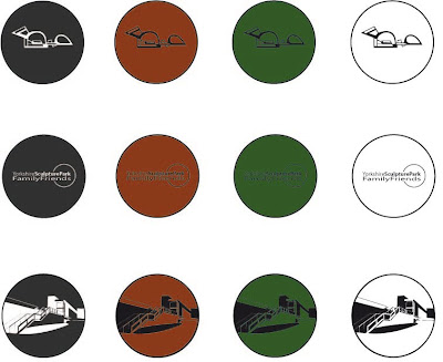
Badges
3 badge designs printed in 4 alternative colours. badges width of 25mm. Sold at £2 for a single badge and then £1 for any successive badges.
Poster
Poster
This Poster would be printed in 920 x 610mm on to a matt recycled paper and sold for a price of £3.99 on to laminated paper or £4.99 on to a matt recycled paper to cover the increased cost of recycled materials.
Lunchbox
The net shape would be printed out of an A3 page and printed on to laminated card. They would be sold in the shop at £2 as a disposable item, rather than a souveneir.
Canvas Shoulder Bag
Tesign printed on 350x400 mm canvas bag. Sold at £7 to include roughly equal amounts of material cost, printing cost and profit.
Badges
3 badge designs printed in 4 alternative colours. badges width of 25mm. Sold at £2 for a single badge and then £1 for any successive badges.
Product Development: Bags
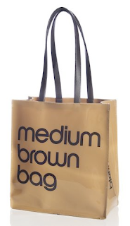
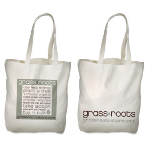
After the initial idea for a product "bag", the next issue was what "type" of bag. We only ever considered doing a shoulder bag, as these are cheaper to produce and more likely to sell, as they are cheaper to produce and more likely to sell than, for example, a rucksack. Ideas for bag designs came from looking at examples of popular shoulder bags, such as Bloomingdales brown bags. During this process recyclable shopping bags, such as the increasingly popular hessian bags, such as fairtrade, eco-friendly bags for Jute. It was concluded that a canvas shoulder bag would be the best product for multiple uses such as an accessory bag/hand bag "thing" as well as a recyclable shopping bad. relvent images or the products, as well as some designs are included below.
The above images were taken from
http://www.bloomingdales.com
http://www.jute.uk.com
http://www.grassrootsstore.com
The above images were taken from
http://www.bloomingdales.com
http://www.jute.uk.com
http://www.grassrootsstore.com
Friday, 5 March 2010
Stenciling
Fiona's ideas and research
The sheep theme by itself doesnt help to produce an environment for the character to be within, also just having a sheep is plain looking and I think its missing something. The next logical step that relates to the YSP and also to our work is a nature theme, which is to some extant already included within out work.
Here are a few reseacrh images that include a style that I think fits perfecting and I think the look of buttrerflies and birds just adds a nice touch.
Thursday, 4 March 2010
Product Development: Lunchboxes
It was felt that cardboard constructed lunchboxes were easier to product on demand, and contained more of an organic character, in keeping with the nature of the park, than plastic lunchboxes with a sticker on. We took the nets of popular cardboard boxes from fastfood restaurants, such as the happy meal box from MacDonalds or the boxes from KFC.
It was found that neither of the boxes could be produced at the same size without using a piece of card larger than A3. We felt that, whilst the KFC box was easier to produce from the net shape, the Happy Meal box is of more use in that it can be reclosed (as can the KFC box) but it also has a handle (which, in the final design, will require changing, as the current one is based round the Macdonalds logo), allowing it to be carried about easier.
Above are the scans of the net layout for each box, as well as a reproduction of the net, with red denoting fold lines and blue denoting cut lines.
Tuesday, 2 March 2010
Our Definition of Friendship
After much discussion debate and research we came up with the following definition of friendship:
The definition of friendship is the co-operative and supportive relationship between the sculpture park and its exclusive members.
Friday, 26 February 2010
Product Development: T-Shirts
It is largely accepted that the most popular t shirt designs revolve around a logo/image in the central chest area, as is the way with these branded/merchandised t-shirts below.Working with this idea, the below t-shirts are put forward as potential product designs; available in a variety of popular, un-garish colours. The designs (recycling the logo and image ideas so as to create a "brand") were made to look un-specific to age or gender, making them available to the entire family.
The found images of t-shirts were found from the product selling sites:
http://www.ultimate-80s.com
http://www.8ball.co.uk
http://www.folksy.com
http://www.atticusclothing.com
The found images of t-shirts were found from the product selling sites:
http://www.ultimate-80s.com
http://www.8ball.co.uk
http://www.folksy.com
http://www.atticusclothing.com
Product Development: Posters
Inspired mainly from my favourite poster design, I began to use the aerial views as the basis of a poster design, with the ideas working around using the identifiable and dynamic shape of the aerial view as an abstract but bold image. the prototype, unrefined design (not yet including the infomation about the friends scheme), as well as the poster that inspired it and some early quickly constructed ideas are below.
The above poster design for the Beethoven concert was taken from image-sharing networking site http://www.ffffound.com
Image Ideas & Development
Whilst we had initially begun using the idea of "sheep" as the central image to our products, we fell short upon receiving constructive feedback for the idea. We then "re-invented" the idea to use it as an icon for the children of the family to associate with. This idea progressed into using the image of a family of sheep on our products to use to represent and portray the family values of our friendship scheme.
Upon developing this concept and an actual image that would be presentable and approachable, where the idea once felt relevant and easily linked in with the Park, it began to feel tenuous and forced.
Still reluctant to actually include any single artists work in the designs, my focus turned to the (award-winning) architecture of the main building, as well as the geography of the park. This provided a stronger, more unique, visual link to the identity of the park. The solid, line based, vector images complimented well both the aerial views and "on foot" perspective views of the building.
Subscribe to:
Posts (Atom)